Projects
Model Testing and Targeting: Lift, Calibration, and the Campaign Audience
Part 5 of 6. Judging the model on the untouched test set, then turning its scores into a real campaign audience with business rules and a holdout.
Every metric in Part 4 - Training the model came from the validation set. This article opens BrightCart's test set for the first time, 59,175 customer-weeks the model has never influenced a single decision about. Then it goes one step : turning that ranked list into a list of customer IDs someone can actually email.
Output Analysis - Deciles: The view a marketer actually wants
Ranking customers by score and cutting the ranking into 10 equal-size groups is called deciles. This process answers the question a campaign manager cares about more directly than any single metric: if I contact my best group, how much better does it do than average?
The table below ranks customers by the raw LightGBM score from Part 4. Only the order of the scores matters here, so no calibration is needed to read it.
| Decile | Customers | Buyers | Purchase rate | Lift |
|---|---|---|---|---|
| 1 (highest) | 5,918 | 902 | 15.2% | 6.4x |
| 2 | 5,917 | 75 | 1.3% | 0.5x |
| 3 | 5,918 | 58 | 1.0% | 0.4x |
| 4 | 5,917 | 50 | 0.9% | 0.4x |
| 5 | 5,918 | 56 | 0.9% | 0.4x |
| 6 to 10 | 29,587 | 270 | 0.9% | 0.4x |
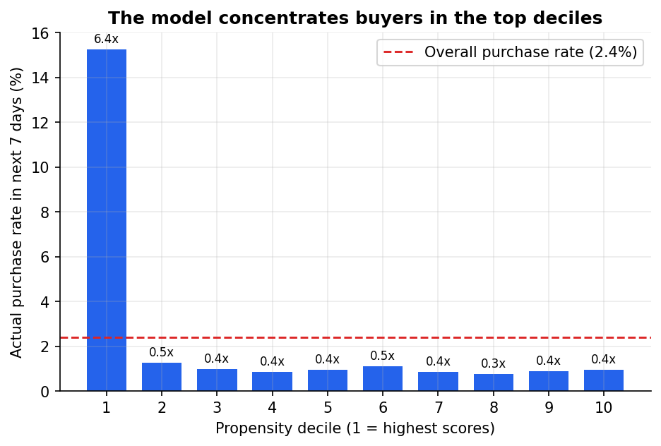
Decile 1 has a 15.2% purchase rate, a 6.4x lift over the 2.4% base rate, and holds 64% of all buyers. Deciles 2 through 10 barely differ from each other.
The shape of the graphs is bery interesting to look at, and it's common enough to expect this type of output in a well-behaved propensity model. Almost all of the model's value sits in one decile.
Deciles 2 - 10 all sit well below the overall purchase rate and it lies between 0.8% - 1.3%. This is useful to know before anyone gets attached to a plan involving deciles 2 or 3: the model isn't finding meaningfully more signal there, and treating it as though it does will disappoint marketers whoever budgets for it.
Output Analysis - Cumulative Gain - How far down the list is worth going
The following is a gain curve and it answers a different question: as you contact more and more customers, starting from the highest score, what share of all buyers have you reached?
It is more like a cumulative distribution function than a bar chart, and it is the most common way to visualize a model's value in marketing analytics.
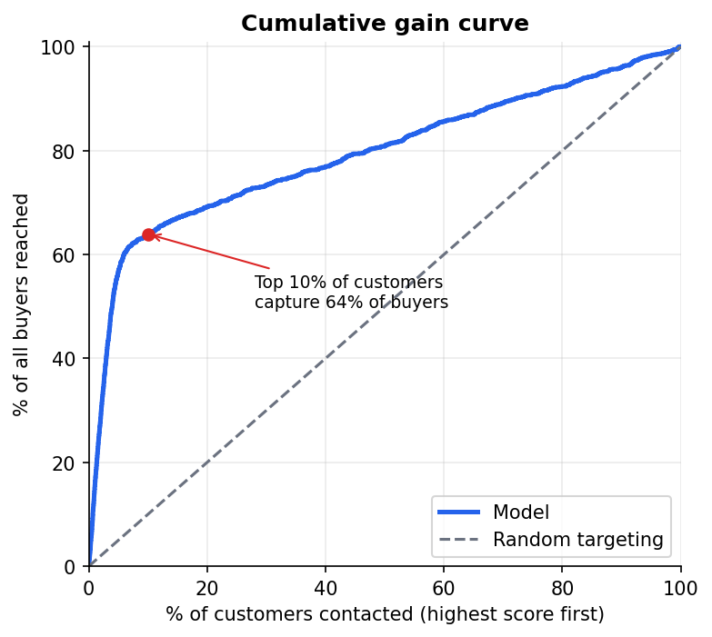
The top 10% of customers, ranked by score, capture 63.9% of all buyers in the test set.
How to read this chart: sort customers by score from highest to lowest, then walk down the list computing what fraction of all eventual buyers you've accumulated so far. Plot that against the fraction of customers contacted. A model with no skill traces the diagonal, since a random 10% of customers would contain about 10% of buyers. Ours reaches 63.9% at the same point.
Contacting the top 10%, 5,917 customers, gives a precision of 15.2% and a recall of 63.9%: about two out of three buyers sit inside a slice one-tenth the size of the full active base. That's the number worth repeating to a CFO, and it's close to the "two-thirds of buyers" figure used as a planning assumption back in Part 1 - Purchase Propensity Modeling.
Model Calibration: To do before any score becomes a probability
The deciles, lift and gain above only use the order of the scores, so the raw scores from Part 4 - Model Training were fine for them. A money decision is different. Expected margin is a probability multiplied by $25, so the score itself has to be a real probability. The raw scores are not. This table groups the test customers by raw score and shows what each group actually did:
| Raw score band | Customers | Average raw score | Actually bought | Average after calibration |
|---|---|---|---|---|
| 0.70 and above | 1,189 | 0.75 | 33.9% | 34.0% |
| 0.50 to 0.70 | 1,218 | 0.63 | 26.3% | 25.7% |
| 0.30 to 0.50 | 763 | 0.40 | 12.8% | 14.1% |
| 0.10 to 0.30 | 3,633 | 0.15 | 2.6% | 2.7% |
| Below 0.10 | 52,372 | 0.05 | 0.9% | 0.8% |
Customers the model scored around 0.75 bought 33.9% of the time. Across all customers the raw scores average 8.6% against a real purchase rate of 2.4%. This is the side effect of class weights described in Part 4.
The fix is calibration: a second, small model that maps each raw score onto the purchase rate that customers with that score really show. We used isotonic regression, fitted on the four validation weeks only and then checked on the test weeks it had never seen. The last column of the table shows the result. After calibration, each band's average score lands almost exactly on what happened. The overall effect on the test set:
| Raw scores | Calibrated scores | |
|---|---|---|
| Average predicted purchase probability | 8.6% | 2.3% |
| Actual purchase rate | 2.4% | 2.4% |
| Brier score (lower is better) | 0.0294 | 0.0198 |
| Top 10% lift | 6.4x | 6.4x |
For comparison, a lazy guess that gives every customer the base rate scores about 0.023 on the Brier score. The raw scores lose to that guess and the calibrated scores beat it. The ranking is untouched, with the same 6.4x lift: calibration changes what each number means, and customers keep their order. How calibration works, why isotonic regression and Platt scaling gave nearly the same result, and what the Brier score measures are covered in two standalone articles, Calibration: turning a ranking into a probability you can actually trust and The Brier score: one number for whether your probabilities can be trusted.
From here on, every score in this article is a calibrated score.
From a ranked list to a real threshold
The decile table and the gain curve tell us the model works. They don't tell us where to stop. "Contact the top 10%" is a habit, not a decision. A better question is: for which customers does contacting them make money?
A simple money rule
BrightCart's marketing team says one contact (an email or an ad) costs $1, and one order earns $25 of margin. Take two customers:
- Customer A has a 10% chance of buying. Expected margin is 0.10 × $25 = $2.50. That is more than the $1 cost, so contact them.
- Customer B has a 2% chance of buying. Expected margin is 0.02 × $25 = $0.50. That is less than the $1 cost, so contacting them loses money on average.
The turning point sits at 1 / 25 = 0.04 (a 4% chance). Below that score, the expected margin doesn't cover the cost of the contact. This is the break-even score.
Comparing different cut-offs
A cut-off means "contact everyone whose score is at least this number". The table shows what each cut-off would have done in the final test week, using the calibrated scores. Expected buyers is the sum of the selected customers' calibrated probabilities. The last column is the expected margin minus the cost of the contacts, calculated as buyers × $25 − customers × $1.
| Rule | Customers selected | Expected buyers | Margin minus cost |
|---|---|---|---|
| Fixed threshold 0.70 | 0 | 0 | $0 |
| Fixed threshold 0.30 | 238 | 80 | $1,762 |
| Fixed threshold 0.10 | 415 | 111 | $2,360 |
| Break-even (0.04) | 503 | 117 | $2,422 |
| Top 10% cut-off (0.012) | 801 | 123 | $2,274 |
Read it from the bottom up. Going from the top-10% cut-off to the break-even cut-off drops 298 contacts ($298 saved) and loses only 6 buyers ($150 of margin), so we come out ahead. Going on from 0.04 to 0.10 would save 88 more contacts ($88) but lose 6 buyers ($150 of margin), so we would be worse off. The break-even rule gives the best result in the table.
Why 0.70 selects nobody
It is tempting to pick a round number such as 0.70 ("only contact customers who are 70% likely to buy"). On the calibrated scores that selects no one, because even BrightCart's single highest-scoring customer that week has a calibrated score of only 0.36. That is correct behavior: about 2.4% of customers buy in any given week, so almost nobody is truly 70% likely to buy.
The raw scores would have given a different and misleading answer. A raw cut-off of 0.70 would have selected 178 customers that week, and a raw cut-off of 0.04 would have selected 5,112, about seven in ten active customers. Across the whole test set, customers with a raw score above 0.70 bought only 33.9% of the time. A cut-off means what it says only when it is applied to calibrated scores.
What to keep in mind about the 0.04 rule
Because the scores are calibrated, 0.04 is a fair break-even: customers at or above it are expected to earn back the cost of contacting them. Two things can still move it. Calibration was fitted on May's data, so it should be re-checked as the model ages, which is the subject of Part 6. And the rule assumes every order earns $25 and every contact costs $1. Change either number and the break-even moves with it.
Business rules turn a model population into a campaign population
Part 2 - Model Designing drew a distinction between the modeling population (everyone active enough to score) and the targeting population (everyone eligible for the campaign). Here is that distinction with real numbers, filtering one rule at a time:
| Step | Customers remaining |
|---|---|
| Active customers scored | 7,371 |
| Propensity at or above the break-even rule | 503 |
| ...with marketing consent | 429 |
| ...not contacted in the last 3 days | 387 |
| Final campaign audience | 354 |
Almost a quarter of the economically worthwhile customers dropped out on consent and contact frequency before the campaign ever launched, and a further 33 were held back as a control group. A model that never accounts for these rules will overstate how many people it can actually reach. Marketing will also ask why a particular customer is on the list. SHAP answers that for any individual customer, as shown in Opening the black box: explaining the model with SHAP.
Model Testing: A/B Testing to Validate the Model
The 387 eligible customers don't all receive the campaign. 33 of them, chosen at random, get held back as a control group, leaving 354 in treatment. Nothing about this holdout depends on the model at all: it's a coin flip applied after the eligibility rules, so the two groups look statistically identical except for whether they got contacted.
Without it, a rise in orders after the campaign proves nothing. Buyers who were already going to purchase this week would show up in the results regardless. With it, comparing the treatment group's purchase rate to the holdout's purchase rate isolates the campaign's actual effect, which is the whole subject of Part 6 - Beyond Propensity Scores.
Key takeaways
- A decile table usually shows most of a propensity model's value sitting in the top one or two deciles, with the rest close to noise.
- A gain curve answers "how far down the list is worth going," and the single most quotable number from it is what share of buyers the top slice captures.
- Ranking metrics like deciles, lift and gain only need the order of the scores. A money decision needs the scores to be real probabilities, so calibrate first, then apply a break-even rule tied to real costs and margins. Here calibration cut the Brier score from 0.0294 to 0.0198 and left the 6.4x lift unchanged.
- Business rules like consent and contact frequency can remove a large share of an economically ideal audience, and a holdout group is what turns "we ran a campaign" into "we can prove what the campaign did."
Part 6 - Beyond Propensity Scores uses that holdout to ask a harder question than "who is likely to buy": who buys because of the campaign, and how do you know the model is still working three months after you shipped it?