Projects
Beyond Propensity Scores: uplift, production, and keeping a model honest over time
Part 6 of 6. Propensity versus uplift on a simulated randomised campaign, a production architecture, and how to monitor a model for drift.
The BrightCart CFO's opening line in Part 1 - Understand Purchase Propensity Model from basics was "show me incremental revenue per dollar, not open rates." Everything built so far answers a related but different question: who is likely to buy? This article answers the question the CFO actually asked, then covers what it takes to keep answering it correctly once the model is live for months rather than one afternoon.
Propensity finds buyers. Uplift finds buyers the campaign creates.
The model from Parts 4 and 5 answers one question: who is likely to buy? It cannot answer a different one: who buys because we contacted them?
Answering that needs a comparison between customers we contacted and similar customers we left alone. BrightCart's clickstream data records what customers did on the site, including visits that arrived from an email link, but not which customers were sent a campaign. It has no such comparison.
So for this part we step away from BrightCart's data and build a small made-up world where we can run that test. Read everything below as a stand-in for a real A/B test:
- We fabricate 60,000 customers. Each one has a secret type that decides how likely they are to buy on their own and how much an email changes that. We know the types because we wrote them. No model is allowed to see them.
- We flip a coin for each customer. Heads, they get the email, tails, they do not. This is the A/B test, and the coin flip is what makes the comparison fair.
- We record who bought.
- We split the 60,000 customers at random into two halves of 30,000. Two models learn from the first half. The second half, which the models never saw, is where we measure the results. There is no new list of customers.
- A note on the secret types. In this made-up world we wrote them. We chose how common each type is, how likely each one is to buy with and without the email, and which visible clues each type tends to show (persuadables, for example, tend to be price sensitive). Nothing was estimated from BrightCart's data.
- In a real A/B test nobody has a type label. Each customer is either emailed or not, so you never see both outcomes for the same person. What you do see is the purchase rate in the emailed group and in the left-alone group, and you can compare those rates for any slice of customers who look alike. The two-model method below automates that comparison.
- The four types are then names for what the estimates show: a high uplift looks like a persuadable, a near-zero uplift with a high baseline looks like a sure thing, and so on. Real customers sit on a spectrum, and the four boxes are a simplification.
This data is separate from the customers and models in Parts 3 to 5, and nothing here changes those results. Because we wrote the secret types ourselves, we can also check the answer at the end, which you can never do with real customers.
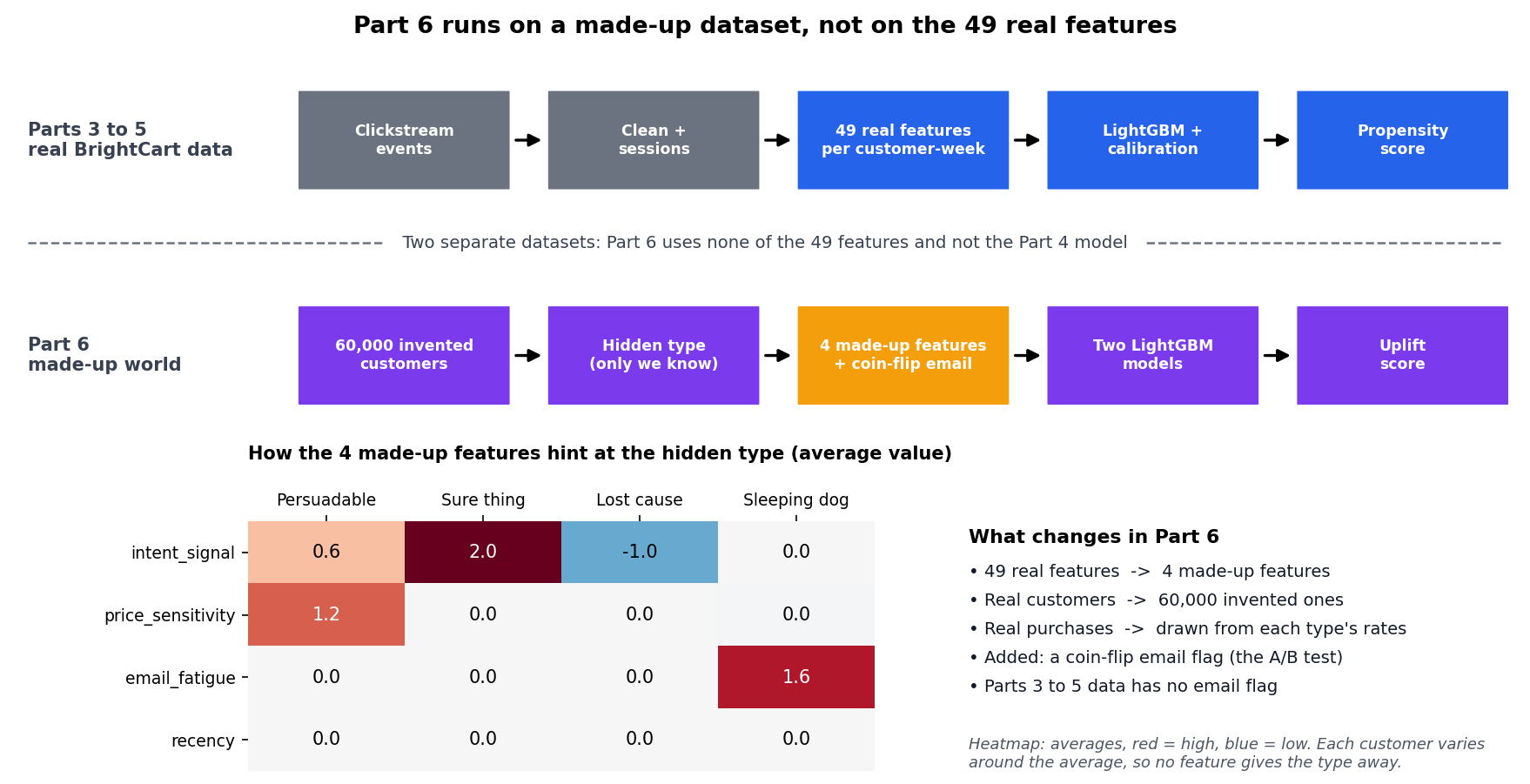
Part 6 uses its own made-up dataset. The 49 real features from Parts 3 to 5 do not exist for these customers, so each one gets four invented features that hint at the hidden type.
Heatmap interpretation: each cell is the average value of a feature for one type of customer, with red for high and blue for low. Sure things have a high intent_signal (2.0) and lost causes a low one (-1.0). Persuadables are price sensitive (price_sensitivity 1.2), and sleeping dogs show email fatigue (email_fatigue 1.6). recency is pure noise, with an average of 0 for every type. Each customer varies around these averages, so no single feature gives the type away, and the models have to combine the clues.
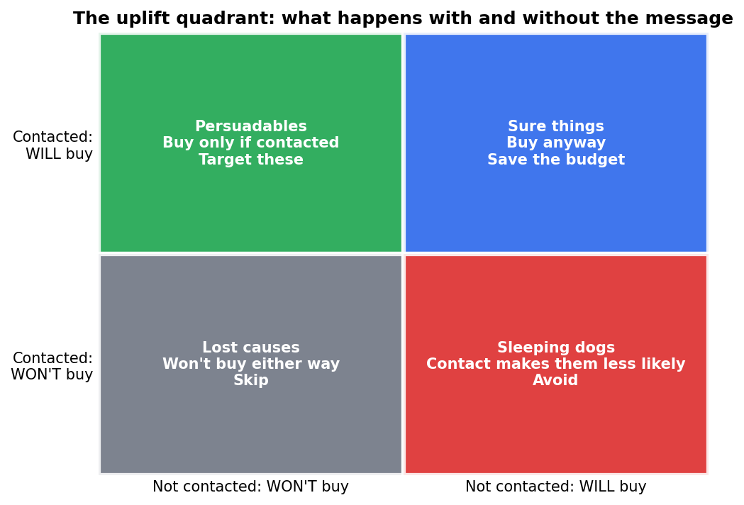
A propensity model can't tell these four groups apart. It is the uplift model that tries to answer that question.
A propensity model only tells us who is likely to buy. It can't tell us who buys because of our email. To see why, think of the four types of customer:
- Persuadables. They buy only if we contact them. This is the group we want. In our experiment the email raised their purchase rate by 16.5 percentage points, from 12.0% without the email to 28.5% with it.
- Sure things. They buy whether or not we email them. Emailing them wastes the contact, because the order would have happened anyway. The email changed their behavior by about 0.
- Lost causes. They don't buy either way. Emailing them also wastes the contact. The email changed their behavior by about 0.
- Sleeping dogs. The email actually makes them less likely to buy, perhaps because it annoys them. In our experiment the email lowered their purchase rate by 6.8 percentage points. These are the people we should leave alone.
A propensity model scores Sure Things and Persuadables as high-probability buyers, so it can't separate them. To tell the groups apart, we need to compare what a customer does when emailed with what they do when left alone.
How the two models give an uplift score
With the experiment data we train two models of the same kind (LightGBM) on the first half (Trained on a total 30,000 customers with 15,000 as control in first model and 15,000 as treatment in second model). Each model sees only four visible features per customer: intent_signal, price_sensitivity, email_fatigue and recency.
- The first model learns from customers who were not emailed. It predicts the chance of buying with no email. This is a propensity model like the one in Part 4, but trained on a group where nobody was contacted.
- The second model learns from customers who were emailed. It predicts the chance of buying with the email.
Subtract the first prediction from the second and you get the uplift score: how much the email changes this customer's chance of buying. A sure thing scores near zero, a persuadable scores high, and a sleeping dog scores below zero.
Measuring the difference it makes
With a held-out half of the simulated customers, each ranking method was used to pick the top 30% to email, and the incremental buyers actually produced were counted against a randomly targeted 30% and against emailing everyone:
| Strategy | Customers emailed | Incremental buyers | Incremental per 1,000 emails |
|---|---|---|---|
| Random 30% | 9,000 | 245 | 27.2 |
| Highest propensity, top 30% | 9,000 | 502 | 55.8 |
| Highest uplift, top 30% | 9,000 | 887 | 98.6 |
| Email everyone | 30,000 | 904 | 30.1 |
- Ranking by uplift and emailing less than a third of the list produced 887 incremental buyers, nearly matching the 904 produced by emailing all 30,000 customers, at less than a third of the contacts.
- Ranking the same 30% by propensity instead found only 502, since a chunk of that top slice was sure things who were always going to buy.
Because the emails were assigned at random in this half too, we can count the email's effect inside any slice of customers. Take the top 30% by uplift score, which is 9,000 customers. In that slice, 29.0% of the customers who got the email bought, against 19.1% of those who did not. That gap of about 9.9 points, applied across the 9,000 customers, gives 887 extra buyers (the percentages are rounded). The other rows of the table use the same calculation on a different slice.
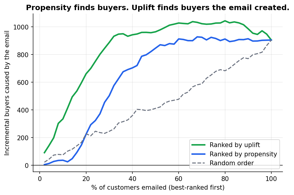
Incremental buyers as more of the ranked list gets contacted. The gap between the uplift and propensity curves is money left on the table by targeting on likelihood alone.
Because the simulation is randomised, we can also check whether the uplift model recovered something close to the truth, or merely a plausible-looking ranking:
| Segment | Share of customers | Measured uplift | True uplift |
|---|---|---|---|
| Persuadable | 25.0% | +16.5pp | +16.0pp |
| Sleeping dog | 9.9% | -6.8pp | -7.0pp |
| Sure thing | 14.8% | -0.6pp | 0.0pp |
| Lost cause | 50.3% | -0.7pp | 0.0pp |
In the table above, "share of customers" is simply how many of the 30,000 held-out customers belong to each secret type. The two purchase rates come from comparing customers of that type who got the email with those who did not, and the true uplift is the value we wrote into the simulation. This table is an answer key. It can be built only in a simulation, because real customers do not come with a known type.
The two persuadable-relevant rows land within a point of the truth. Sure things and lost causes show a small negative uplift that should be exactly zero, which is sampling noise from a finite holdout rather than a systematic error.
One condition makes all of this trustworthy: the treatment assignment has to be genuinely random. An uplift model trained on a campaign where the "control" group was actually just customers marketing chose not to bother with will confuse who marketing already skips with who the campaign doesn't help, and the two are rarely the same people. If you don't have a randomised holdout somewhere in your history, you don't yet have the data to build a real uplift model, whatever a vendor's dashboard tells you.
What this means for the real BrightCart campaign
The calibrated model from Part 5 cannot give you uplift on its own. It was trained on who bought, with no record of who was contacted, so a sure thing and a persuadable look the same to it. Calibration makes its probabilities honest, but it does not change what the probability measures.
Getting real uplift needs the experiment we simulated here. Three things would have to change in the real campaign:
- Randomise on purpose. Contact a random half of a broad group of customers that includes mid and low scorers, and hold the other half back. Part 5's holdout is not enough for this: it has 33 customers and is drawn only from customers who already cleared the break-even rule.
- Train the two models on the results and score customers by uplift.
- Change the decision rule. Part 5 contacted anyone whose calibrated probability times $25 covered the $1 cost. With uplift the rule becomes: contact a customer when their uplift times $25 covers the cost. Calibration still matters, because uplift is a difference of two probabilities and both need to be honest.
Could you skip the test and estimate uplift from past campaigns? Sometimes, but only if the customers who were contacted were chosen without regard to how likely they were to buy. In marketing they rarely are, because people tend to contact the customers they expect to buy. That is why a randomised holdout is the safe route.
What running this looks like day to day
A model that lives in a notebook helps nobody. Here is the shape BrightCart's system took once propensity scoring became a recurring job rather than a one-off analysis.
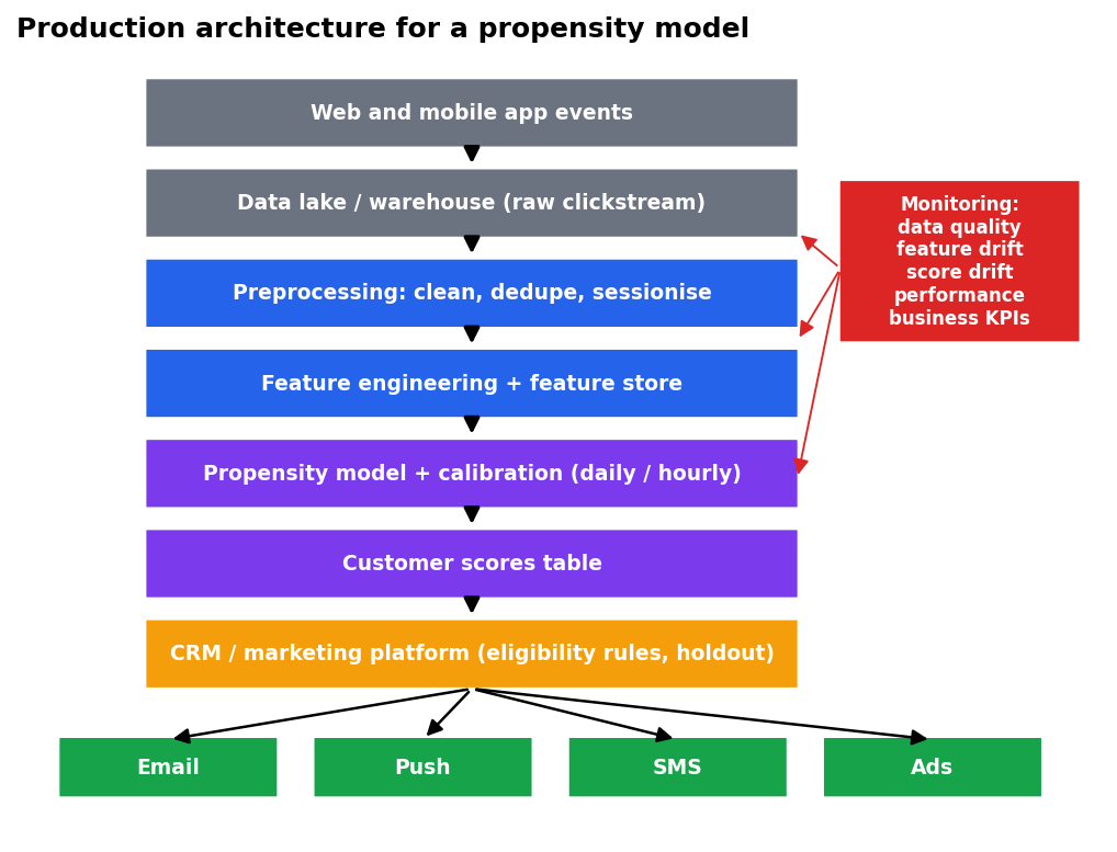
Events flow up through cleaning and feature engineering into a model, and scores flow down into the channels marketing actually uses. Monitoring watches every stage of that flow.
Raw events land in a warehouse continuously. Cleaning, sessionising, and feature engineering, the work from Part 3 - Data Preparation, run on a schedule, ideally producing the same feature values whether they're computed for training or for a live scoring run: a mismatch between the two, known as train-serve skew, is a common source of a model that scored well in testing and does something else in production. The model itself, plus its calibration step from Calibration: turning a ranking into a probability you can actually trust, gets retrained less often than it scores, since retraining needs fresh labels to validate against and scoring doesn't. Scores land in a table the CRM platform reads, where the eligibility rules from Part 5 - Model Testing and Targeting turn a ranked list into the campaigns customers actually see.
Model Drift: Is the model still working?
A model doesn't announce when it goes stale. Customer behavior drifts, a site redesign changes what a "product view" even means, and the only warning is usually a slow decline nobody notices until a quarterly review.
The Population Stability Index (PSI) compares the shape of a feature today against its shape during training. Below 0.10 is considered stable, 0.10 to 0.25 worth investigating, above 0.25 a real shift. Across the 12 real weeks after training, BrightCart's features stayed almost perfectly still, with the single largest weekly PSI reading never exceeding 0.0024. To see what an actual shift looks like, we simulated a website redesign that inflated product views per visit and shifted traffic toward mobile:
| Feature | PSI, normal week | PSI, after simulated redesign |
|---|---|---|
| Unique products viewed | 0.000 | 3.90 |
| Product views (30 days) | 0.001 | 1.95 |
| Product views (7 days) | 0.000 | 0.74 |
| Events per session | 0.001 | 0.65 |
| Desktop ratio | 0.000 | 0.42 |
A PSI of 3.90 is not a subtle signal. It is a feature whose entire distribution changed shape, and it is exactly the kind of thing that should trigger a look at the underlying tracking before anyone touches the model itself, since the same pattern can come from a genuine behavior shift or from a broken event tag.
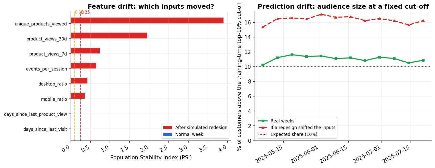
The share of customers above the usual top-10% cut-off stayed between about 10% and 12% across every real week. A simulated redesign pushes it to between 15% and 17% well before anyone runs a feature-level PSI check.
A second, faster check tracks the share of customers landing above the campaign's usual score cut-off. Across the 12 weeks after training, that share held between 10.2% and 11.6%, consistent with a stable population being scored by a stable model. Under the simulated redesign, it climbed to between 15.4% and 17.1%, a warning visible at the score level before anyone digs into individual features.
The scores in these checks are the calibrated scores from Part 5, and that allows a third check: calibration itself. Each week the monitoring script records the average calibrated score next to the share of customers who actually bought. Across the eight test weeks, which the calibration never saw, the two stayed within 0.31 percentage points of each other, and the eight-week averages were 2.30% predicted against 2.38% observed. With about 175 buyers in a typical week, gaps of that size are within ordinary week-to-week noise. A gap that stays on one side for several weeks, or keeps growing, means the scores no longer mean what they say. That is the signal to refit the calibrator even when ranking measures such as ROC-AUC and lift still look fine.
This is also where Part 3's decision to exclude tenure_days from the model pays off. That feature grows by exactly one day for every customer, every day, whether or not it's in the model. Checked against training data, its PSI reads 0.85, comfortably past the "major shift" threshold, for no reason related to customer behavior at all. Any feature that drifts by construction will eventually trip an alarm regardless of what's actually happening on the site, which is a good reason to keep it out of the model rather than out of the monitoring dashboard.
Key takeaways
- A propensity model ranks who is likely to buy. An uplift model ranks who buys because of the campaign, and it needs a genuinely randomised holdout to be trustworthy at all.
- In our simulation, targeting the top 30% by uplift nearly matched the incremental result of emailing everyone, at less than a third of the cost.
- A production pipeline is cleaning, features, model, calibration, and delivery, in that order, with monitoring watching every stage rather than only the final score.
- PSI catches feature-level drift, and the share of customers above a fixed score cut-off catches it a step earlier. A feature that drifts by construction, like tenure, will eventually trigger an alarm regardless of real customer behavior.
- Calibration can drift while ranking still looks fine. Comparing the average calibrated score with the actual purchase rate each week is a cheap check, and a persistent gap means it is time to refit.
That's the end of the six-part build. Three ideas used along the way deserve a closer look on their own: calibration (see Calibration: turning a ranking into a probability you can actually trust), the Brier score (see The Brier score: one number for whether your probabilities can be trusted), and SHAP (see Opening the black box: explaining the model with SHAP).